Minerva Brand Identity
Minerva Hospital is a modern healthcare institution dedicated to providing advanced medical care with a focus on compassion, trust, and innovation.
The client approached us to develop a brand identity that reflects the hospital’s professionalism, reliability, and modern approach. The objective was to create a visual language that is minimal, clean, and attractive — conveying care and trust without overwhelming visuals.


Challenges
- The hospital needed a fresh and cohesive identity that stands apart from typical medical logos.
- The brand required a minimal yet warm visual appeal that communicates both professionalism and empathy.
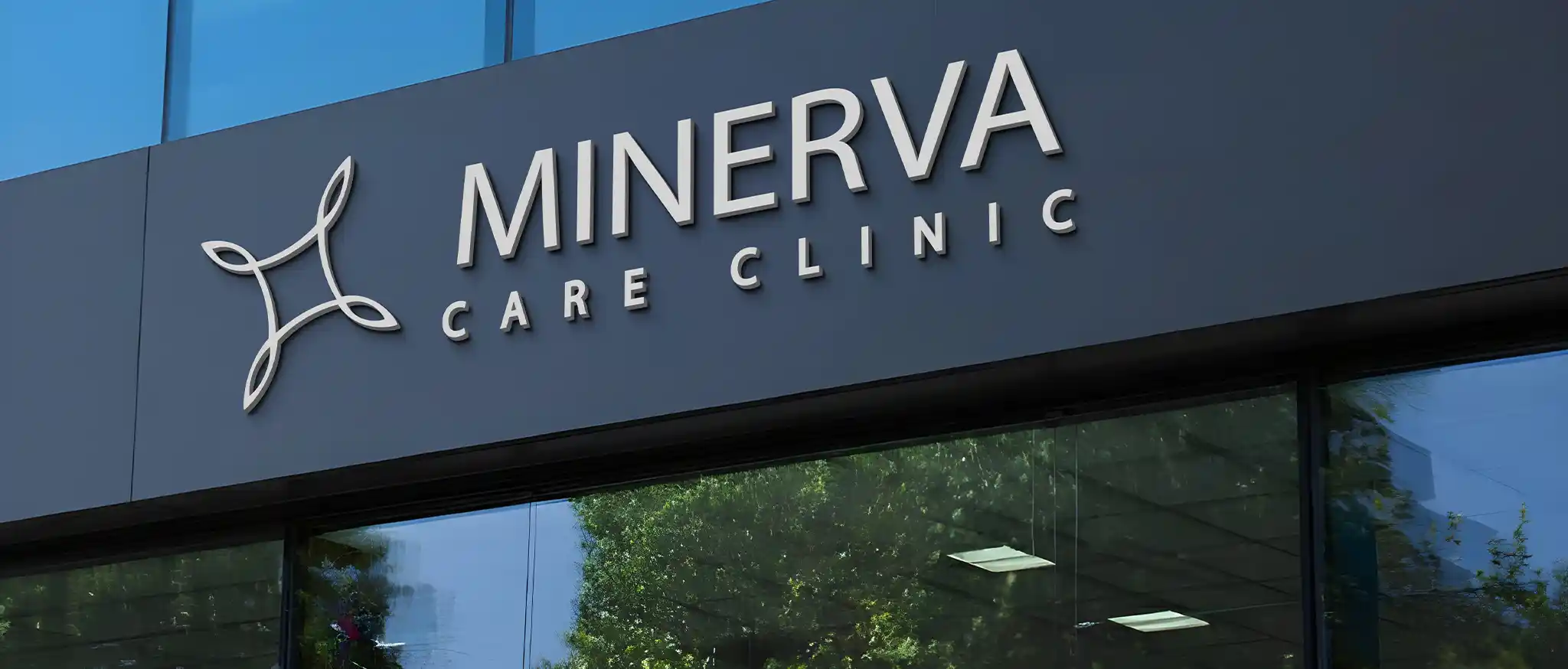
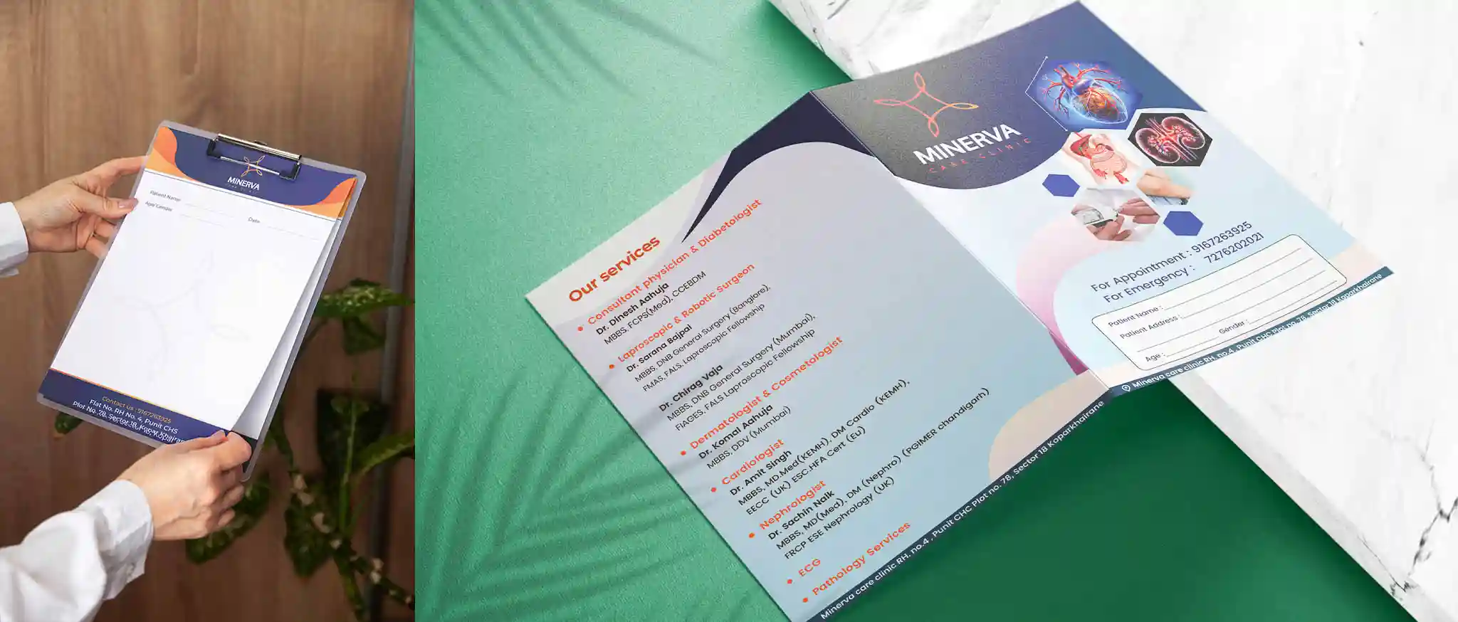
- Ensuring the design works effectively across digital and offline platforms — from signage and stationery to social media and uniforms.
- Balancing clinical precision with a human touch in the design language.
Our Approach
- Started with an in-depth understanding of Minerva Hospital’s mission to combine advanced healthcare with personalized care.
- Focused on developing a minimal design system built on simplicity, balance, and calmness.
- Choose a modern, sans-serif typeface to convey clarity and professionalism.
- Designed a subtle yet symbolic logo mark that reflects health, growth, and care without using overused medical icons.
- Curated a color palette of cool tones — blues, teals, and whites to evoke trust, calm, and wellness.
- Developed consistent visual assets and iconography for both digital and print materials, maintaining a uniform look and feel.
- Created brand guidelines covering logo usage, typography, color palette, and applications to ensure long-term consistency.


Want a logo that tells your story and creates impact?
Connect with us today and get your business logo that resonates.
