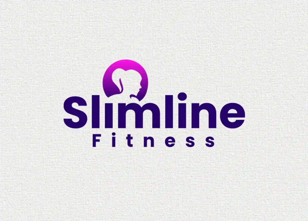
Slimline Fitness Logo Design
Slimline Fitness is a women-exclusive fitness studio baked in Pune. The client approached us to design a logo that represents strength, elegance, and modernity without relying on overused gym symbols like dumbbells or weights.
The goal was to create a modern and recognisable logo that clearly communicates the brand name and appeals to its female audience.

Key Challenges
- The initials “SF” didn’t clearly communicate the brand or its purpose.
- Avoiding generic gym icons like dumbbells or muscle silhouettes, which could make the brand look common.
- Designing a modern, feminine logo that still conveys fitness and confidence.
- Ensuring the logo remains versatile and easily recognizable across both digital and print platforms.
Our Creative Approach
- Began with understanding the brand’s core. Women-only fitness centre focused on women's health and wellbeing.
- Decided to use the full brand name “Slimline Fitness” instead of initials to ensure instant recognition and clarity.
- Took inspiration from contemporary logo trends, where clean wordmarks represent sophistication and confidence.
- Selected a pink and purple gradient color palette to reflect femininity, energy, and motivation.
- Integrated a subtle female silhouette icon that complements the typography without dominating the design.
- Focused on balance and spacing to make the logo adaptable for both digital and print applications.
- Ensured the final logo communicates strength with femine energy, aligning with the brand’s personality and audience.

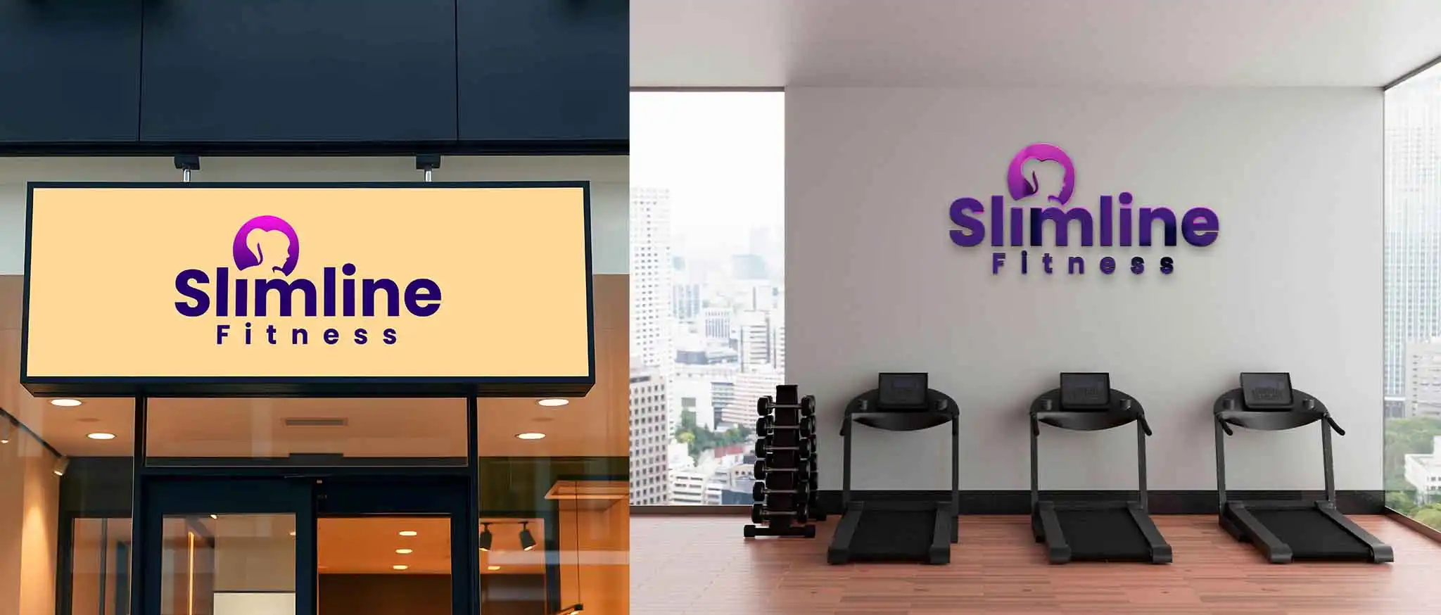
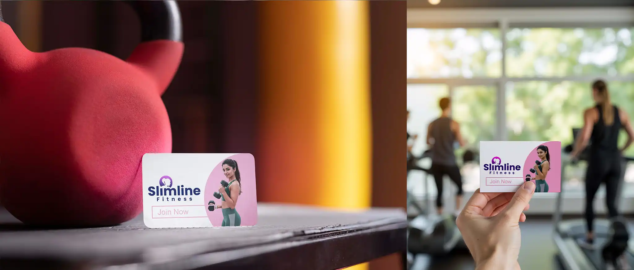
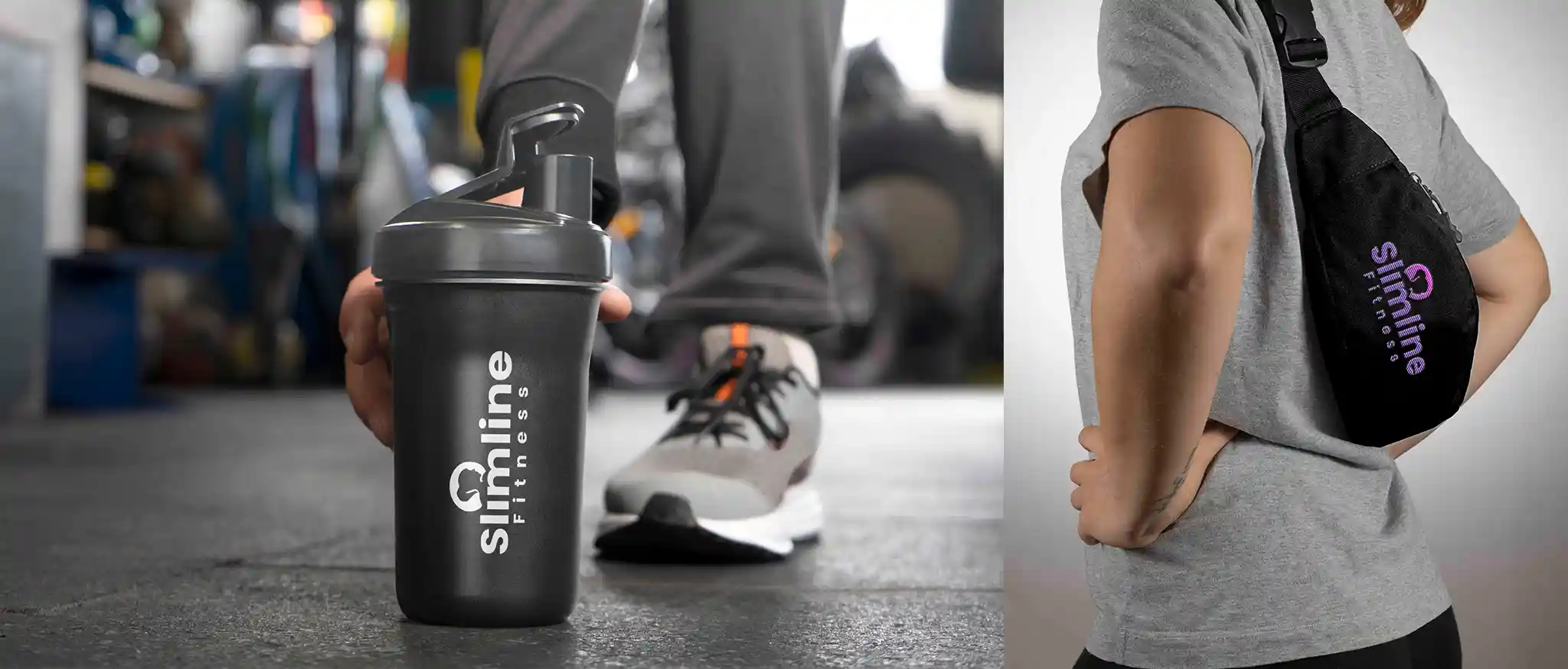
The Final Outcome
Our creative presentation showcased the Slimline Fitness logo in multiple mockups — from signage and apparel to digital platforms. The typography, color balance, and gradient flow were carefully crafted to maintain elegance while ensuring strong visibility and brand presence across mediums.
Want a logo that tells your story?
Connect with us today and get your business logo that resonates.