Ahuja Realty Venture Logo Desing
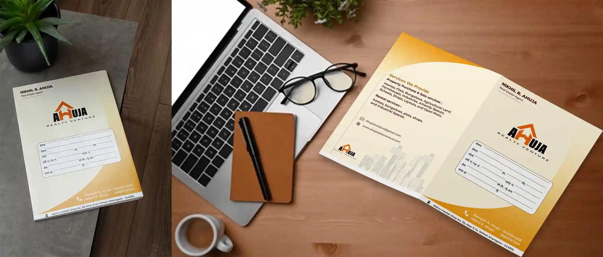
Ahuja Realty Venture is a real estate brand focused on creating homes that embody trust, comfort, and quality living. The logo features a roof element above the “H” in Ahuja, symbolizing safety, shelter, and the essence of residential living.
This subtle design elegantly blends architectural elements with brand identity, reflecting warmth, reliability, and a promise of quality living.
Challenges
- The client needed a logo that communicates trust, safety, and professionalism while remaining approachable and visually distinctive.
- The design had to clearly reflect the real estate domain without appearing overly generic or literal.
- Balancing architectural symbolism with a modern, clean visual identity suitable for both digital and print use.
Our Approach
- Introduced a roof element above the “H” to subtly represent homes, safety, and the core of residential living.
- Chose a dark grey (#221F1F) to convey strength and trust, paired with orange (#EB7022) to add warmth, energy, and approachability.
- Selected Source Sans Variable as the typeface to maintain a modern, clean, and versatile typographic style that works across branding materials.
The Final Outcome
The resulting brand identity communicates trust, warmth, and professionalism, perfectly reflecting Ahuja Realty Venture’s mission to provide quality living spaces.
The logo’s architectural reference, coupled with the carefully chosen colors and typography, ensures a distinctive, approachable, and memorable presence in the real estate industry.
Want a logo that tells your story and creates impact?
Connect with us today and get your business logo that resonates.